Holywoodoo
 Holywoodoo is a digest-sized collection of film posters created for the film market in Ghana, Africa. But this isn’t a film marketplace in any way comparable to that of Europe and the US. In Ghana, Africa, films are released onto a circuit comprising of television sets and video recorders where they play in small huts to the paying public. There is no cinema or projector in the traditional sense, and the movies themselves prove to be an eclectic mix of everything from Hollywood action features, kung fu flicks, animation, through to domestic horror yarns and pot-boilers.
Given this set-up, it is not surprising that the promotional environment is also rather unique. The posters for these films are all hand-painted, executed in a colourful, primitive style. Certainly in the case of the American titles, these posters are often adaptations of the original promotional artwork, but lacking in any detail or technical flair. It’s difficult to see why someone would go to the trouble of painting Charles Bronson in his Death Wish 3 pose when it so closely attempts to replicate the original art. Why not simply use the original art? The same can be said of the machete wielding Michael Berryman in the familiar Cut and Run pose, except that here the odd looking Berryman looks even odder, while the rifle toting individual at the foot of the picture has no discernible facial characteristics at all.
It would be easy to pick through the chronic art in this book, the instances where the likenesses are way off the mark, or the attempts at replicating existing artwork are particularly dire. I’m sure that Juxtapoz readers and the like would argue that I’m missing the point, but to me this is ‘bad art’ — merely an attempt to copy someone else’s work which comes over as a bit of a mess. (The artist for Terminal Force has had a momentous struggle rendering Brigitte Nielsen.)
Far more refreshing are the instances in which clearly no original artwork has been at the disposal of the Ghana publicist, those paintings that rely entirely on the furtive imagination of the artists themselves: take for instance the barmy image used to publicise Scanners 3: The Take Over (comprising solely of a very basic man in very basic flames) or the three fighting femmes that are the Deadly China Dolls (approximating something akin to what Aline Kominsky might draw on a bad day). Species 2 depicts a prone woman with one alien springing from her belly and a second one springing from her chest onto the face of a startled soldier.
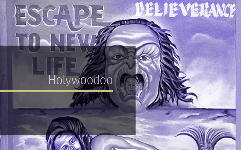
Similarly, posters for homespun movies exhibit a creative flair that is as insane as the films themselves sound (as in the case of much movie promotion however, I doubt that many movies here live up to the promise of their posters). Demonic Cat features a person being torn to pieces by cats (the pet variety), the evident feline leader generating beams from its eyes. A boy with a misshapen head stands nearby (?) holding a bloody dagger. “Deliverance” is the only other word on the poster. Highway To The Grave has a bible, a topless woman in water (beams again radiating from her eyes), a fish tail sticking out of the water, a snake on the grass and a man with a big nose.
Religion is a persistent theme in these films.
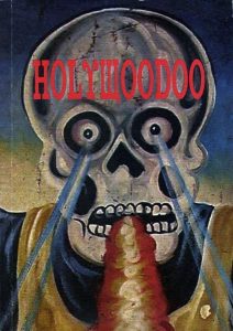
One particular poster advertises a film called Testimony whose tagline is “Good pastor vs Bad pastor”. Beneath a man dressed as a skeleton, the titular pastors’ battle it out with rays radiating from their eyes. Elsewhere in the picture there is a rat with a man’s head, and two women remove a head from a body.
A clear difference in the art for homespun movies and those movies from the West is that for the former the artists devote little energy to depth or perspective. In creating their own little tableaux, the Ghana artists are pretty scattershot with figures and elements of the composition seemingly placed at random over the page. There is almost no regard at all for interaction. Another good case in point is the poster for Evil in the Land. Here, a hunchback man (who may or may not be wearing clothes) squats on a sheet, while all around him are figures and creatures locked in their own particular spaces (a man with his arms outstretched, a cat with a man’s head, faces with wild expressions).
This book is a time capsule containing material I have never seen before. Unless I’m missing something in the short French introduction, I have no idea from what era these posters are plucked (they contain sparse information themselves beyond the name of a distributor and the occasional credit), whether these posters are still in production, or indeed whether cinema in Ghana has advanced at all from television sets and VCRs.
Initially, I thought several of the posters in Holywoodoo were in 3-D but I now realise that the blurry colour separations are lapses in quality control. Whose lapse, though? The printer of the original posters or the printers of this book?
I do like Holywoodoo, even though the paper stock smells bad. It has a sense of wonder.
[Thanks to Roger Sabin]
David Kerekes
Like this article?
Related Posts
Comments
Copyright © Headpress


